A gig poster is the bridge between music and visual art. A carefully crafted medium that carries musicians’ message and visual interpretation, connects artists and audience, many times displayed in public spaces allowing democratic absorption, whether it is the form of a wrinkled up wheat paste slapped onto plywood, washed up in concrete or, and why not, beautifully framed hanging in the immaculate walls of an art gallery.
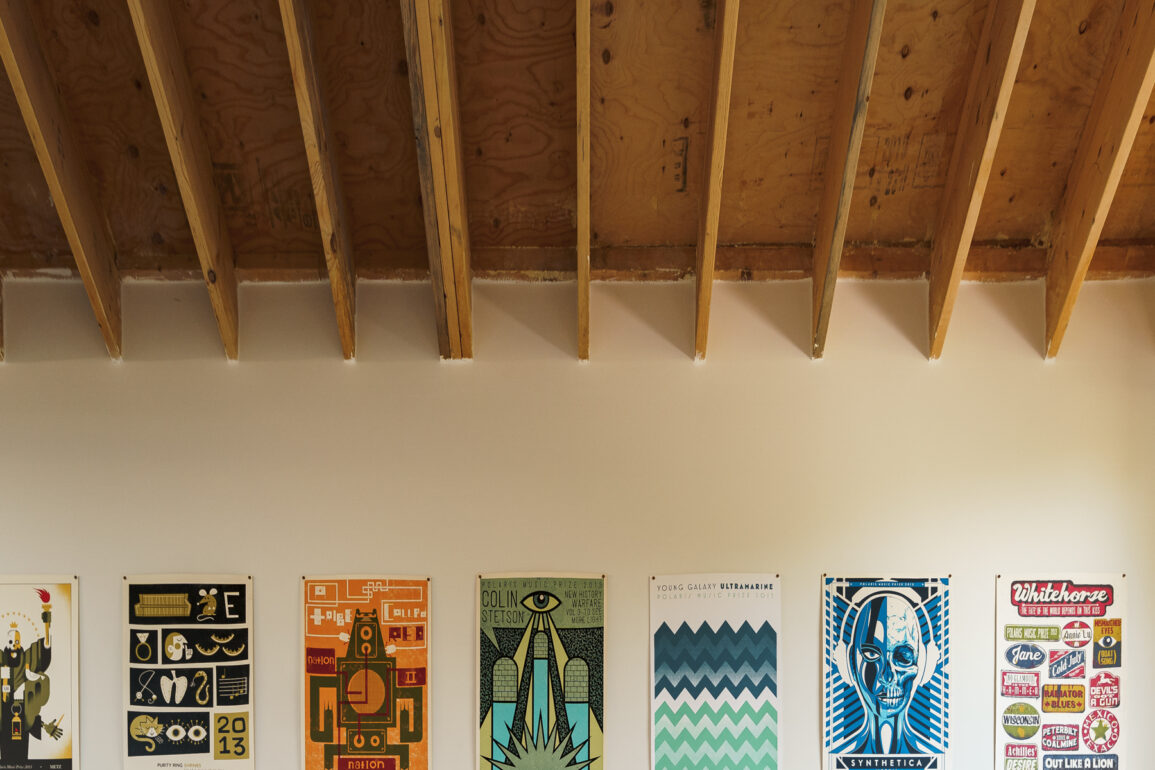
The Polaris Prize Poster Program Exhibition focuses on the screen-printed posters created by Canadian visual artists over the last 16 years, commissioned by Polaris Music Prize and curated by The Office of Gilbert Li [since 2016]. Every year, 10 posters are created for each of the short-listed albums selected by Polaris’ jury.
In digital days, screen printing is one of the coarser ways to create reproductions. In the process of screen printing, ink is pushed through the tiny holes of a mesh screen. The ink is mostly opaque and the colours in each layer don’t mix very much [or in the most predictable ways], so each layer must be meticulously thought out. This makes the process of screen printing, on its own, a form of art and an active research endeavour which is always prone to happy accidents.
The exhibition at Underscore Projects showcased lots of brilliant artwork, here is a selection of some of the many posters that we love for different reasons, in no specific order.
Valmor Garcia is a digital artist working in the video game industry for 13 years, muralist and co-founder of Underscore Projects.
.
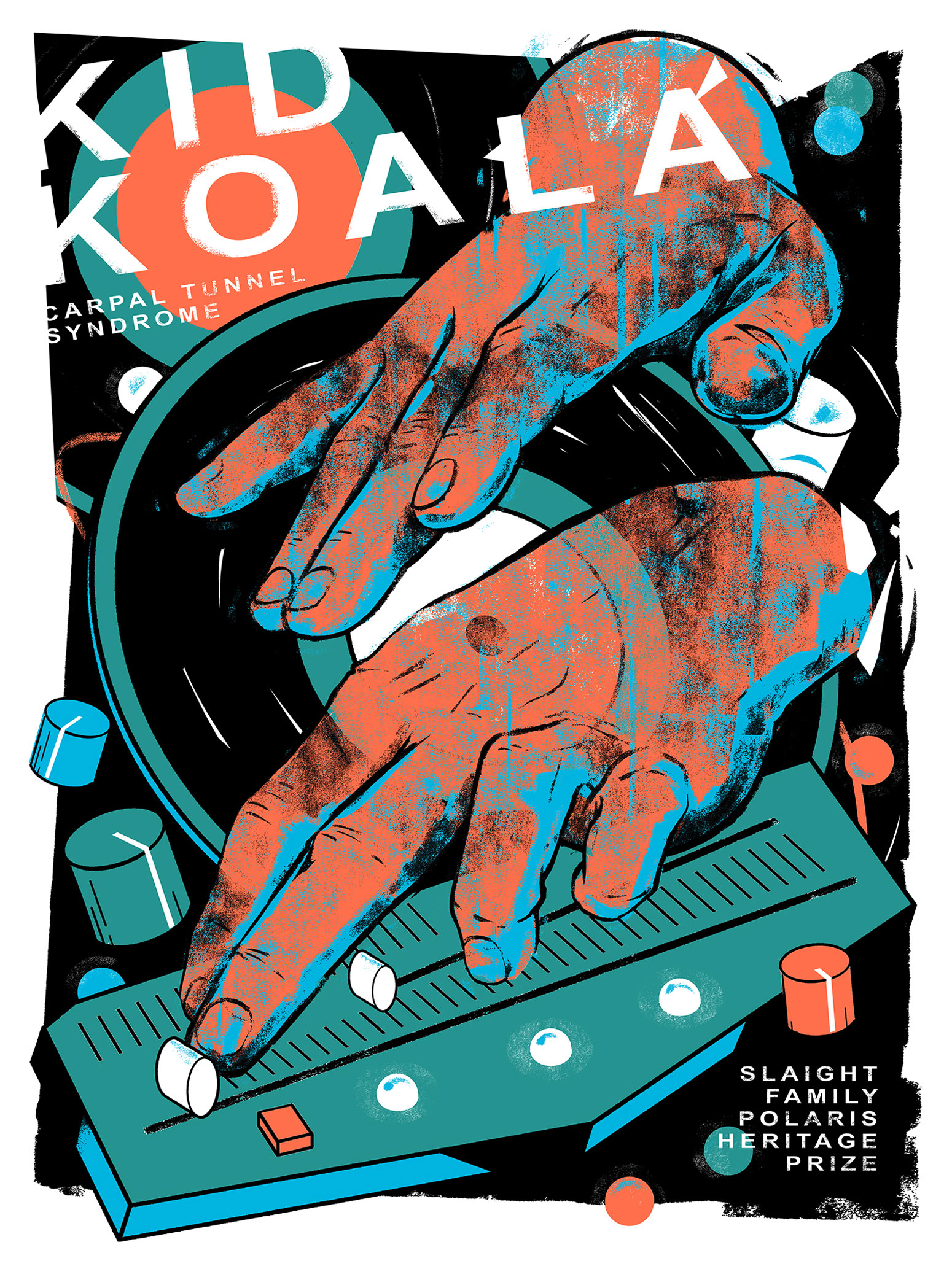
KID KOALA
CARPAL TUNNEL SYNDROME
Besides the dynamic feel of this poster, which perfectly suites the vibe of this album, the amazing scratchy texture applied to the hands, created by the opaque layer of black ink makes us wonder – is that one of those happy accidents? We like to think that’s an improvisation, just like the scratch virtuosic style Kid Koala shows in the album.
.
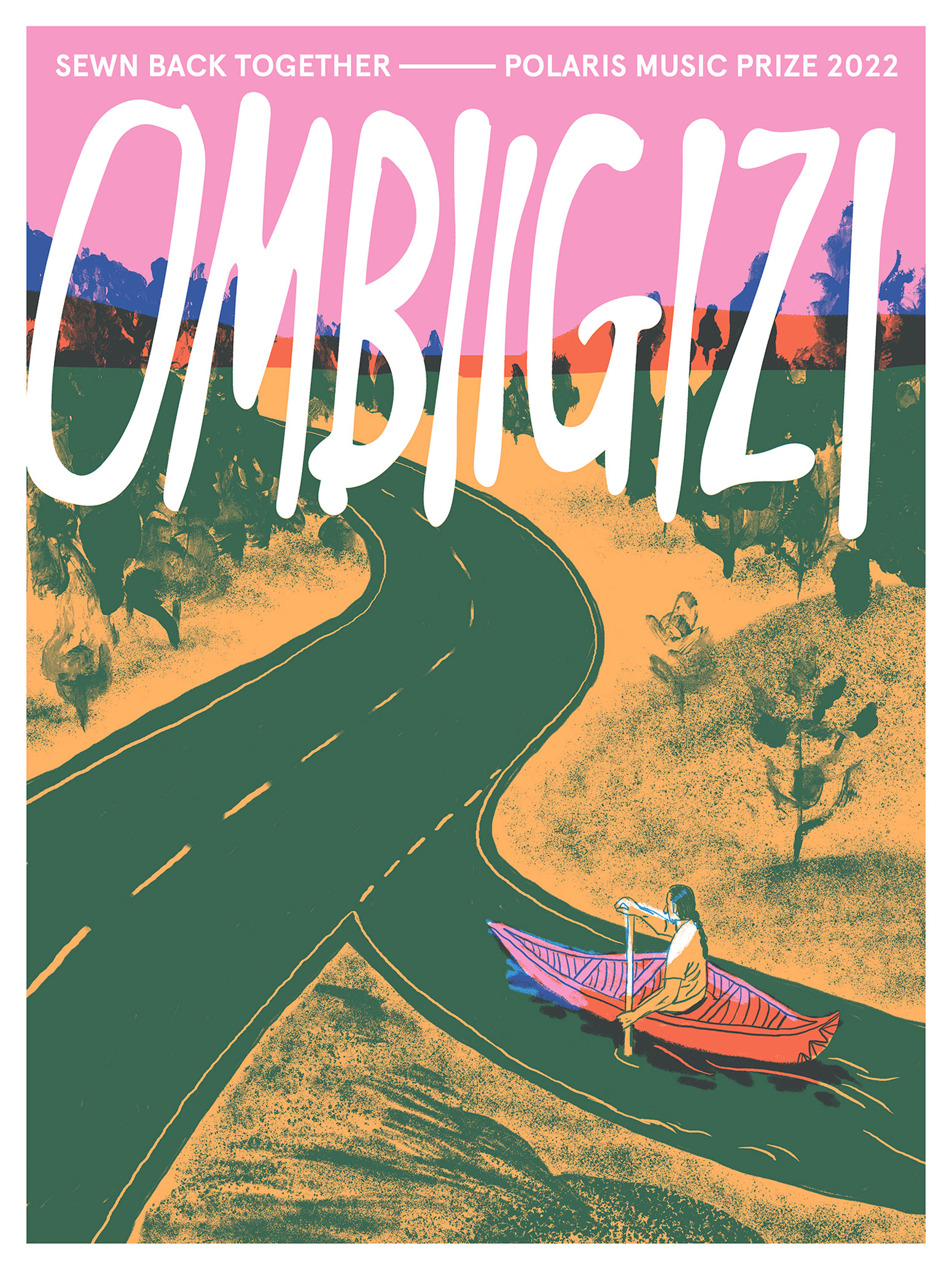
OMBIIGIZI
SEWN BACK TOGETHER
DESIGNED BY JOSEPHINE GUAN
2022
Clever visual metaphor in this design, which according to the artist’s statement, represents the “Indigenous youth figuring out their way forward in today’s society. Like paddling down a river, it can be lonely and overwhelming – but also hopeful and exciting.”
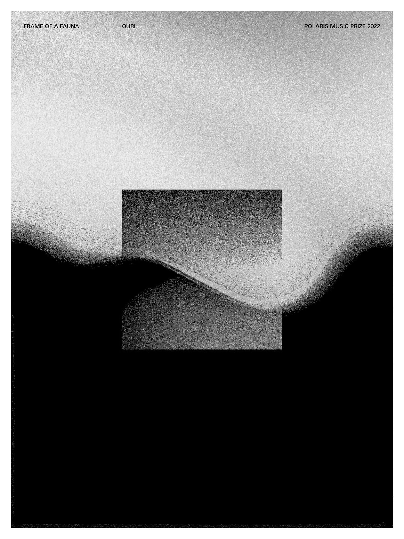
OURI
FRAME OF A FAUNA
DESIGNED BY MARK NEIL BALSON
2022
This mix of geometric and organic frequency-shaped horizontal divide creates a beautiful collage of contrasting elements that relates directly to the vibrancy of the sound carefully crafted by Ouri in this album full of elements and texture. This poster is also printed with a metallic pigment adds a new dimension to the artwork especially when experienced in person.
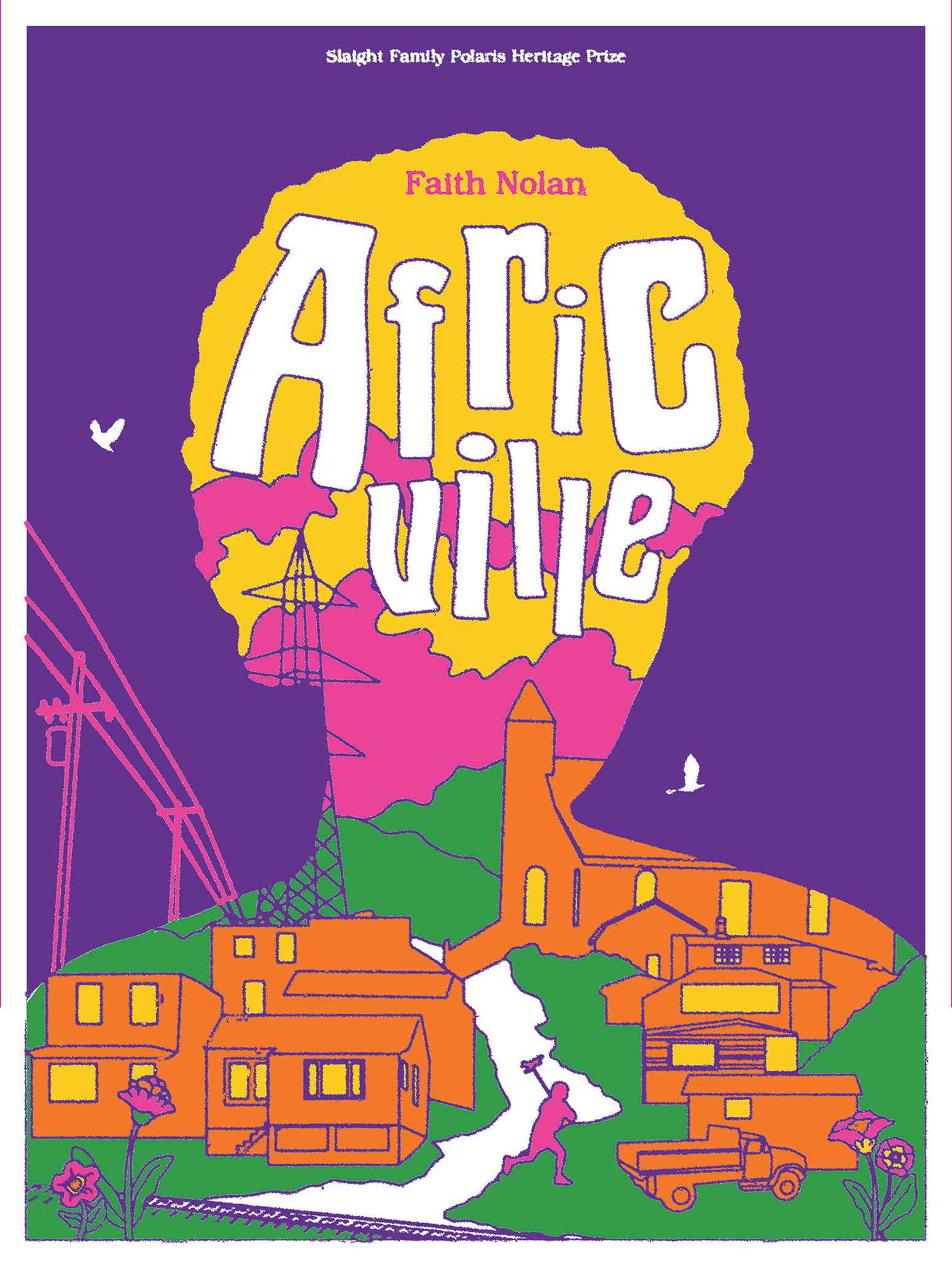
FAITH NOLAN
AFRICVILLE
DESIGNED BY YAZMIN MONET BUTCHER
2021
We love the bright colours and the juxtaposition of Africville’s environment representation on Faith Nolan’s silhouette.
As explained by the artist, this imagery represents the Black community located in the outskirts of Halifax, as seen by its residents: “A bright and beautiful place, full of history and potential”. This poster does a perfect job as a medium inviting the audience into learning more about this album from 1986, a brilliant document and artistic expression that sheds light into an obscure piece of Canada’s history.
.
.
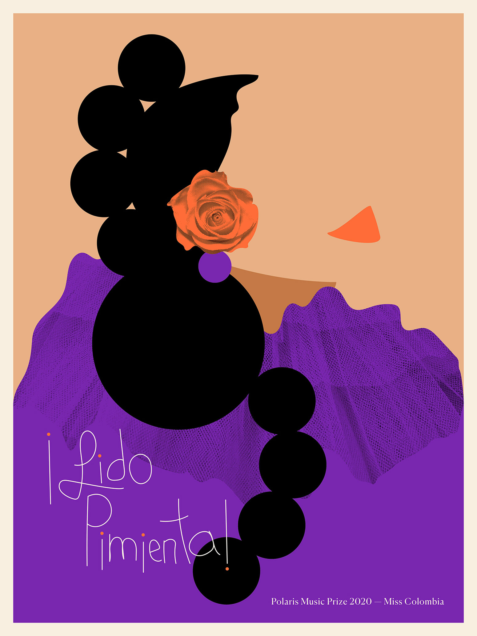
Less is more in this artwork, a minimalistic design of Pimienta’s silhouette formed by strong geometric shapes and bold colors laid as a statement, carrying the strength of the music in this album, overlaid by a fabric texture that, at the same time breaks pragmatic patterns and adds a layer of detail that relates directly to the Latin American cultural heritage.
.
DESIGNED BY DREW NG-HOW-TSEUNG
2009
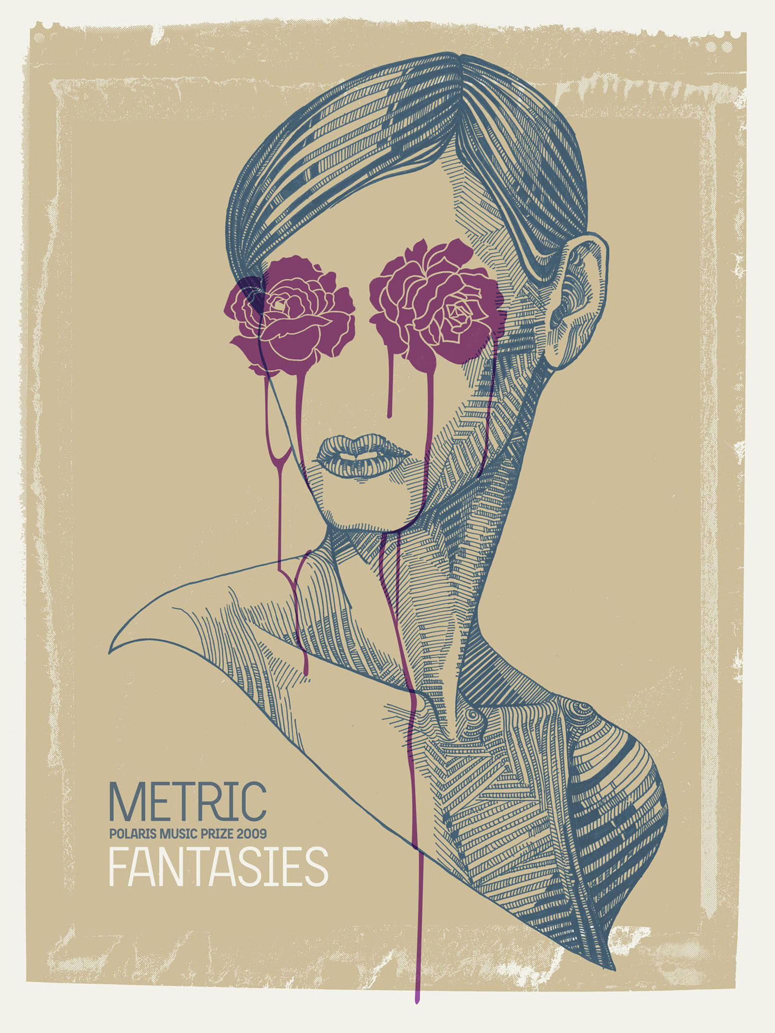
Great composition in this strong yet delicate portrait illustration, clever use of patterns to create lighting shifts. This turns out to be a very different approach for a visual interpretation of this album, but thought it worked out well.
.
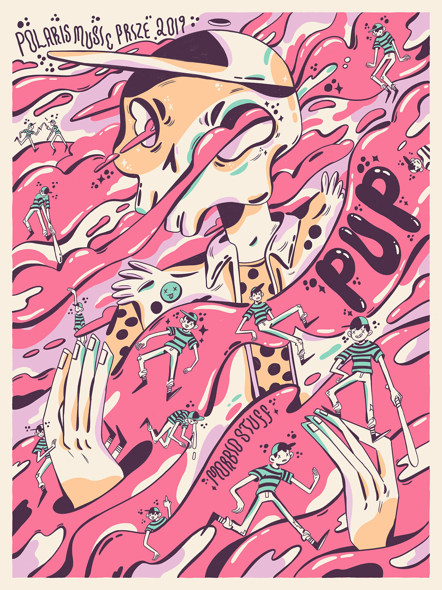
The design compliments the vibe of the band and this album specifically, one can guess the genre and style through the linework, vibrant colors and characters that populate the image. This is a beautiful render and composition using a limited amount of layers that enhances all the strengths of screen printing in comparison to other techniques.
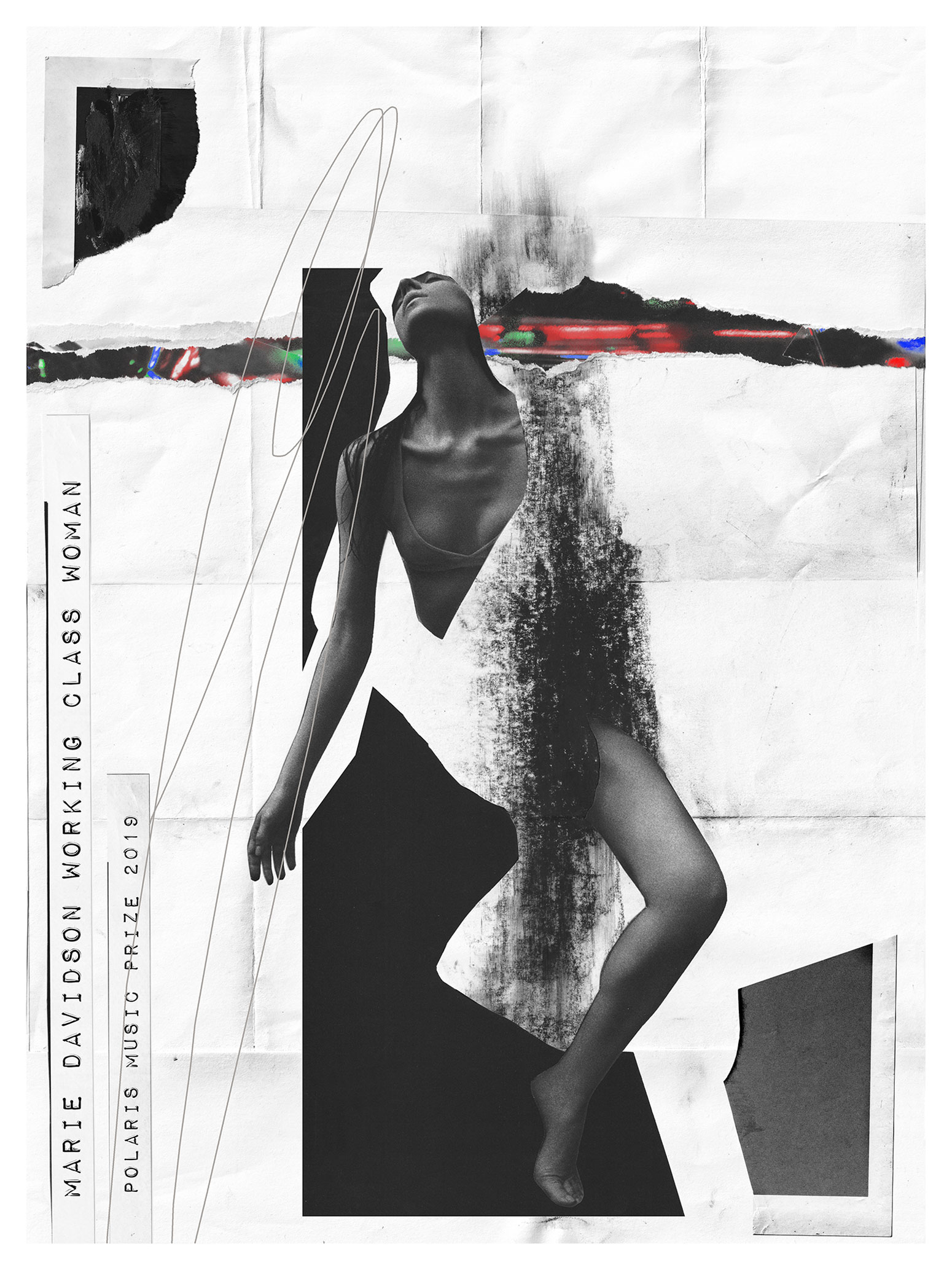
MARIE DAVIDSON
WORKING CLASS WOMAN
DESIGNED BY MELANIE GARCIA
2019
This is an amazing printing plan and execution, the final effect of mixed media makes you second guess the printing technique, even when looking at this piece in person, until you come up close to realize the flattened ink layers applied onto the paper.
We love the attention to detail and the many layers of information that can be found in this artwork, all well-grounded by colors, typography and geometrical shapes. It is a trip on itself to try and interpret all the symbolism in Kendra’s work, we are still working out some of them!
.
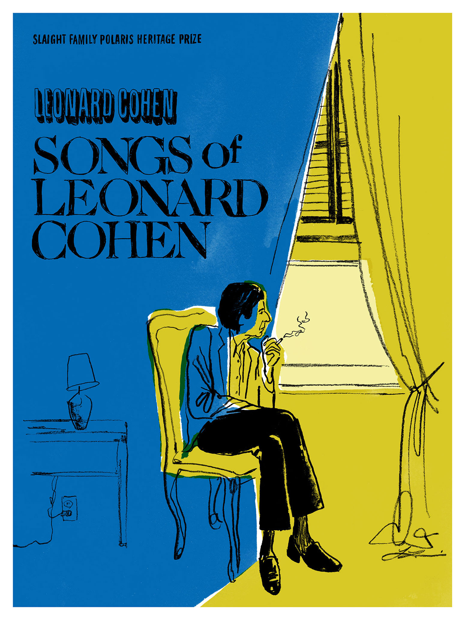
LEONARD COHEN
SONGS OF LEONARD COHEN
We love the bright colors and the juxtaposition of Africville’s environment representation on Faith Nolan’s silhouette. As explained by the artist, this imagery represents the Black community located in the outskirts of Halifax, as seen by its residents: “A bright and beautiful place, full of history and potential”. This poster does a perfect job as a medium inviting the audience into learning more about this album from 1986, an brilliant document and artistic expression that sheds light into an obscure piece of Canada’s history.
.
WORDS: VALMOR GARCIA
ILLUSTRATIONS: UNDERSCORE PROJECTS


You must be logged in to post a comment.